
Charting
In this lesson we will show you:
– The difference between bar, candlestick and line charts
– What price movement is displayed
– Which chart is best for new traders
As we have seen from the last lesson, technical analysis focuses on the use of charts. We will now look at different types of charts and how they are built.
The three types of charts in MT4 are:
– Bar Charts (OHLC)
– Candlestick Charts
– Line Charts
Bar Charts
Bar charts provide opening and closing prices, as well as the highs and lows for that period. This is referred to as OHLC – Open, High, Low and Close.
The bottom of the bar shows the lowest traded price for the chosen period of time, while the top indicates the highest price level that was reached.
The whole bar represents the trading range for the specific time frame being traded – e.g. one whole bar on an hourly (H1) chart shows the activity for that entire hour.
Opening and closing prices are represented by horizontal marks to the left and right of the vertical bar, respectively.
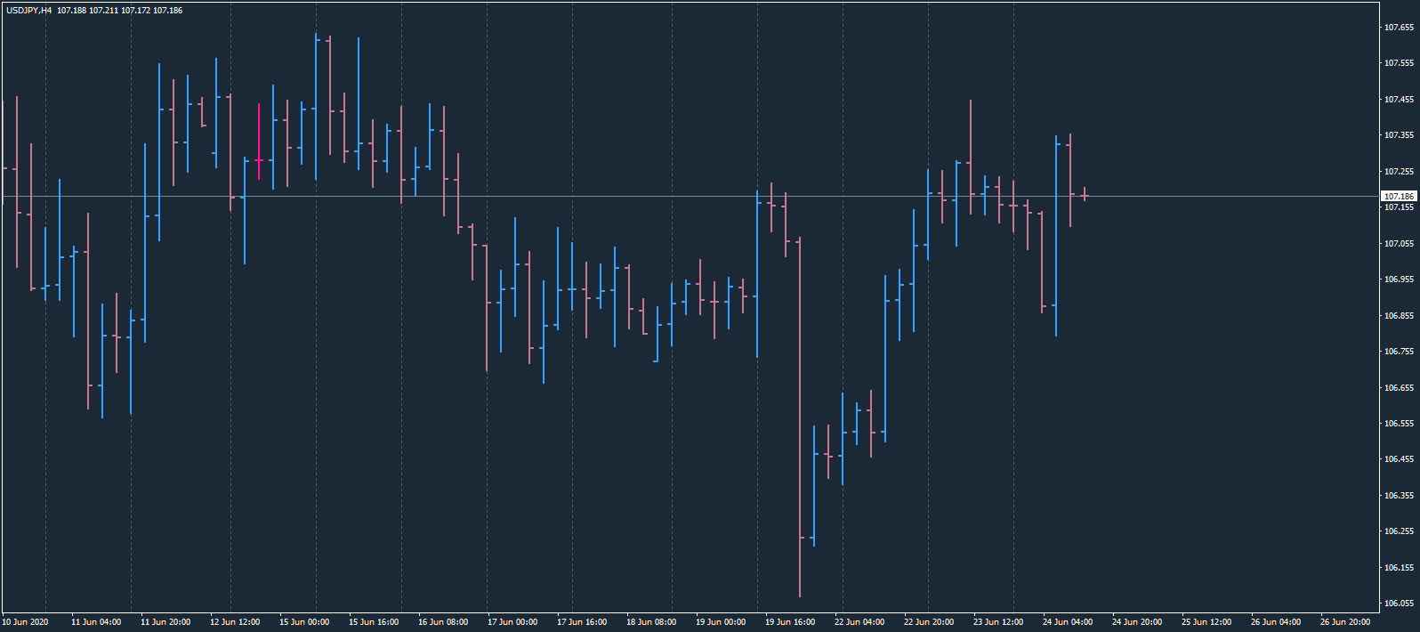
In the example image above, blue bars represent bullish periods when price rose from the opening price of the bar and closed above that opening price, whereas pink bars show bearish periods when price fell and closed below the opening price.
If you have set your line chart to a different colour to the bar chart colours, bars where price entered and exited at the same price will be shown in this colour, as can be seen by the bright pink bar in the chart above.
Candlesticks Charts
Candlestick charts present the same information as bar charts, but are visually more appealing. Similar to bars, candlesticks are coloured to reflect whether price closed above or below the opening price:
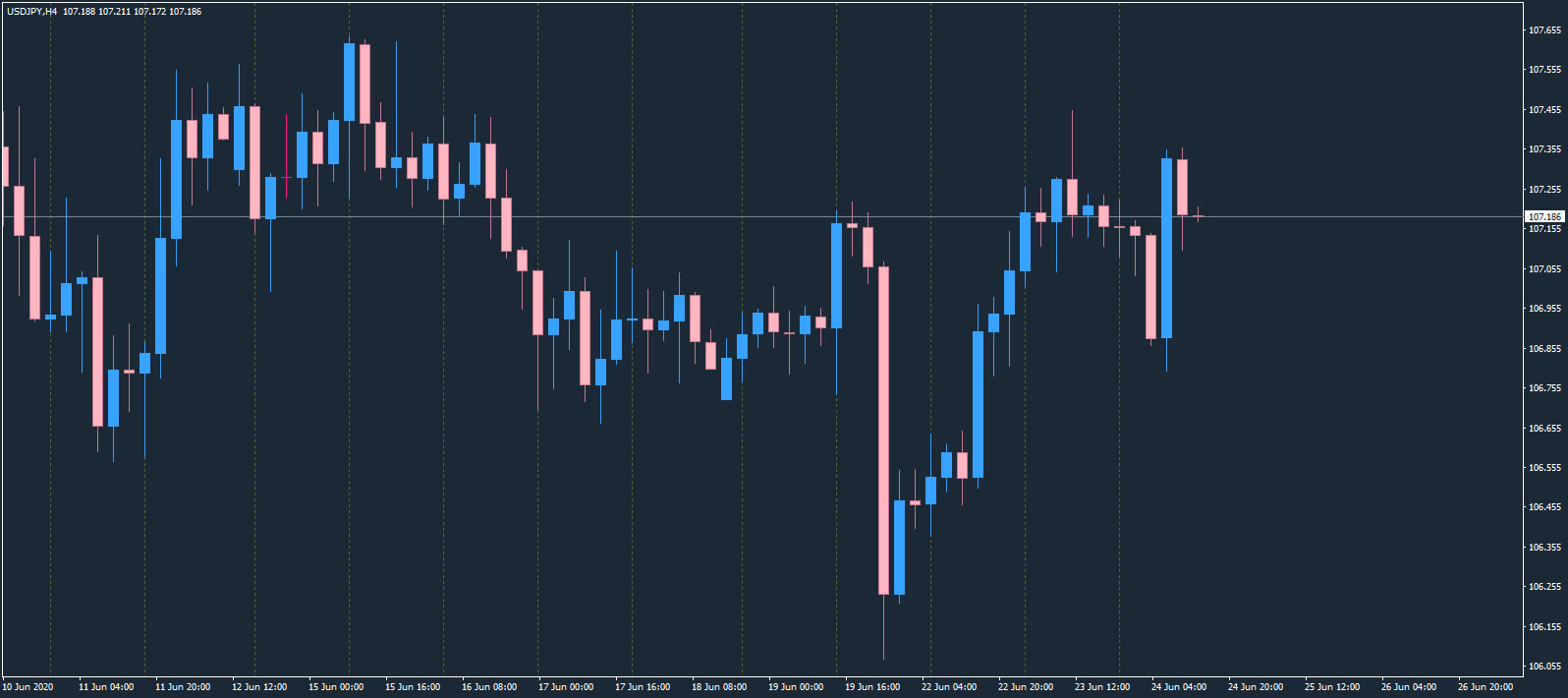
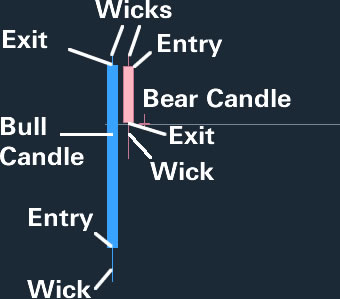
The thicker body of the candlesticks shows the price action between the open and the close. The thin lines at the top and bottom are called “wicks” and show the trading range outside of the opening and closing levels.
In the example of this chart, if a candlestick is blue it is bullish, and the bottom of the thicker body of the candlestick is the entry price and the top is the exit price.
If a candlestick is pink it is bearish, and the top of the thicker body of the candlestick is the entry price and the bottom is the exit price.
The image below shows all the components of both a bullish and bearish candlestick:
Line Charts
Line charts are the simplest form of charts in MT4. They are based on the lines that are drawn from one closing price to the next closing price.
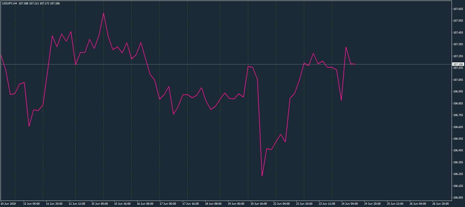
These charts are easy to read and show the general price movement of a market over a specific period of time. However, they lack the additional information and detail that bar charts and candlestick charts provide.
Final Thoughts
You are free to use whichever chart type you prefer. However, due to the extra information and visual appeal of candlesticks, these are the most widely used by traders and it is well worth spending time to learn how to read them.